Why Your Shopify Store Loses Mobile Customers at Checkout
Shopify stores lose mobile customers at checkout because theme and app updates are reviewed on a desktop monitor, so mobile-only bugs — cramped tap targets, a checkout button pushed off-screen, a payment step that overflows at 375px — ship invisibly. Most Shopify traffic is mobile, and mobile checkout abandonment runs well above desktop as a result. The fix: check the checkout at phone width after every theme or app change, not just once at launch.
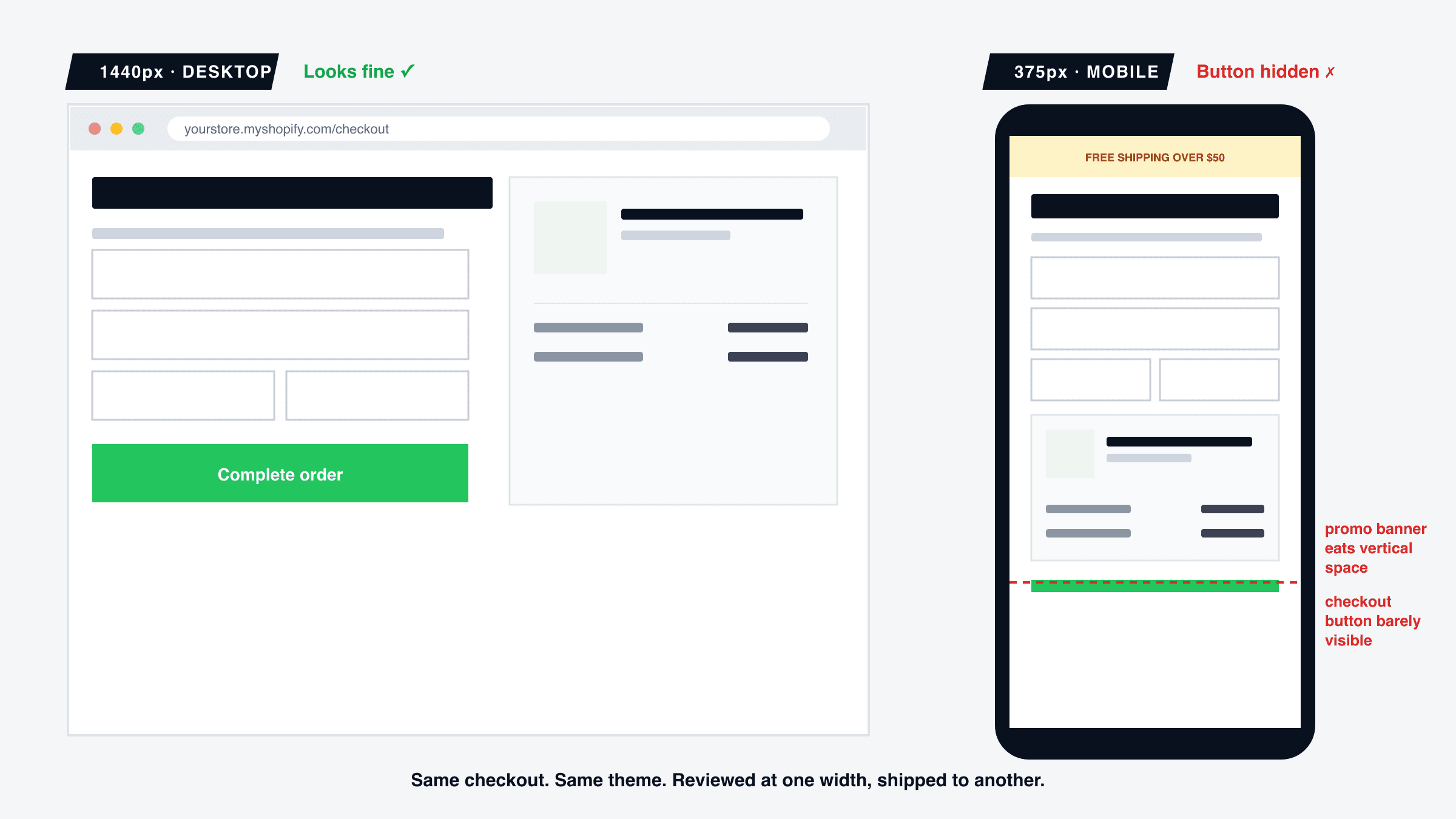
Here's a pattern we see constantly when auditing Shopify stores: the owner is confident the store works — they check it themselves, regularly, on their laptop. Sales are lower than expected, but nothing looks broken. Then we open the same store on a 375px screen and the checkout button is half off the edge of the viewport.
This isn't rare. It's the default outcome of how Shopify stores get built and maintained — reviewed on a desktop monitor, shipped to a customer base that's mostly on a phone. Below: where these bugs actually hide, why they're invisible to you specifically, and the 15-minute check that catches them.
Why does this hit checkout hardest?
Most Shopify traffic today is mobile. Mobile checkout abandonment consistently runs meaningfully higher than desktop across stores — and the reason isn't that mobile shoppers are less committed. It's that checkout is where friction compounds: keyboard-heavy forms, small tap targets, a slower connection, and — critically — the one page on your store customers absolutely cannot work around if something's broken. A confusing homepage costs you a browse. A broken checkout costs you the sale you already had.
Product and collection pages get some visual QA almost by accident — you look at them often, because you're managing inventory and photos. Checkout doesn't get that incidental attention. Most owners look at their own checkout page rarely, and almost always on desktop, which is exactly backwards from where the traffic and the risk both concentrate.
Where these bugs actually hide
1. The checkout button pushed below the fold — or off it entirely
A theme section sized for a wide monitor — an announcement bar, a promo banner, an upsell block — stacks up at mobile width and pushes "Complete order" somewhere the customer has to hunt for. On desktop, where there's room for everything side-by-side, this is invisible. At 375px, every stacked section eats real vertical space the customer has to scroll through at the exact moment they're ready to pay.
2. App blocks that silently stop rendering on mobile
Upsell apps, trust-badge widgets, and shipping-estimate tools inject their own markup into your theme — markup that was tested against one theme version, at one width. A theme update or a conflicting app can make that block render fine on desktop and simply not appear on mobile, so a customer never sees the trust badge or discount prompt that was supposed to close the sale.
3. Tap targets sized for a cursor, not a thumb
Quantity steppers, variant swatches, and the shipping-method radio buttons are often designed at a size that's comfortable to click precisely with a mouse and genuinely hard to tap accurately with a thumb. The customer mis-taps, selects the wrong variant or shipping option, gets frustrated, and — at the checkout step specifically — frustration converts directly into an abandoned cart instead of a support email.
4. Hidden costs that only surface at the very last mobile screen
Shipping and tax added at the final step is one of the best-documented reasons shoppers abandon checkout on any platform. It's worse on mobile: a desktop shopper sees the whole order summary in one glance; a mobile shopper has to scroll to find where the total changed, and often just leaves instead. If your theme doesn't surface shipping cost earlier in the flow on small screens, this is worth checking directly.
5. Express-wallet buttons that look fine, don't launch
Shop Pay, Apple Pay, and Google Pay buttons render as normal buttons even when the underlying flow is misconfigured for a theme customization or a checkout extension conflict — tapping does nothing, or opens a broken sheet. This is a mobile-first failure almost by definition, since express wallets are used disproportionately on phones, and it is invisible unless you actually tap the button on a real device.
Why didn't I catch this myself?
Because you check your own store the way an owner checks it: on the machine you manage it from, which is almost always a desktop or laptop. You're also not a first-time visitor — you know your own layout, so a slightly cramped section doesn't register as broken, it just registers as familiar.
The gap compounds every time you or an app update something. A theme upgrade, a new app install, a promotional banner added for a sale — each one is reviewed the same way, quickly, on desktop, and each one is a fresh chance for a mobile-only regression to ship without anyone seeing it at the width that actually matters.
The 15-minute mobile checkout check
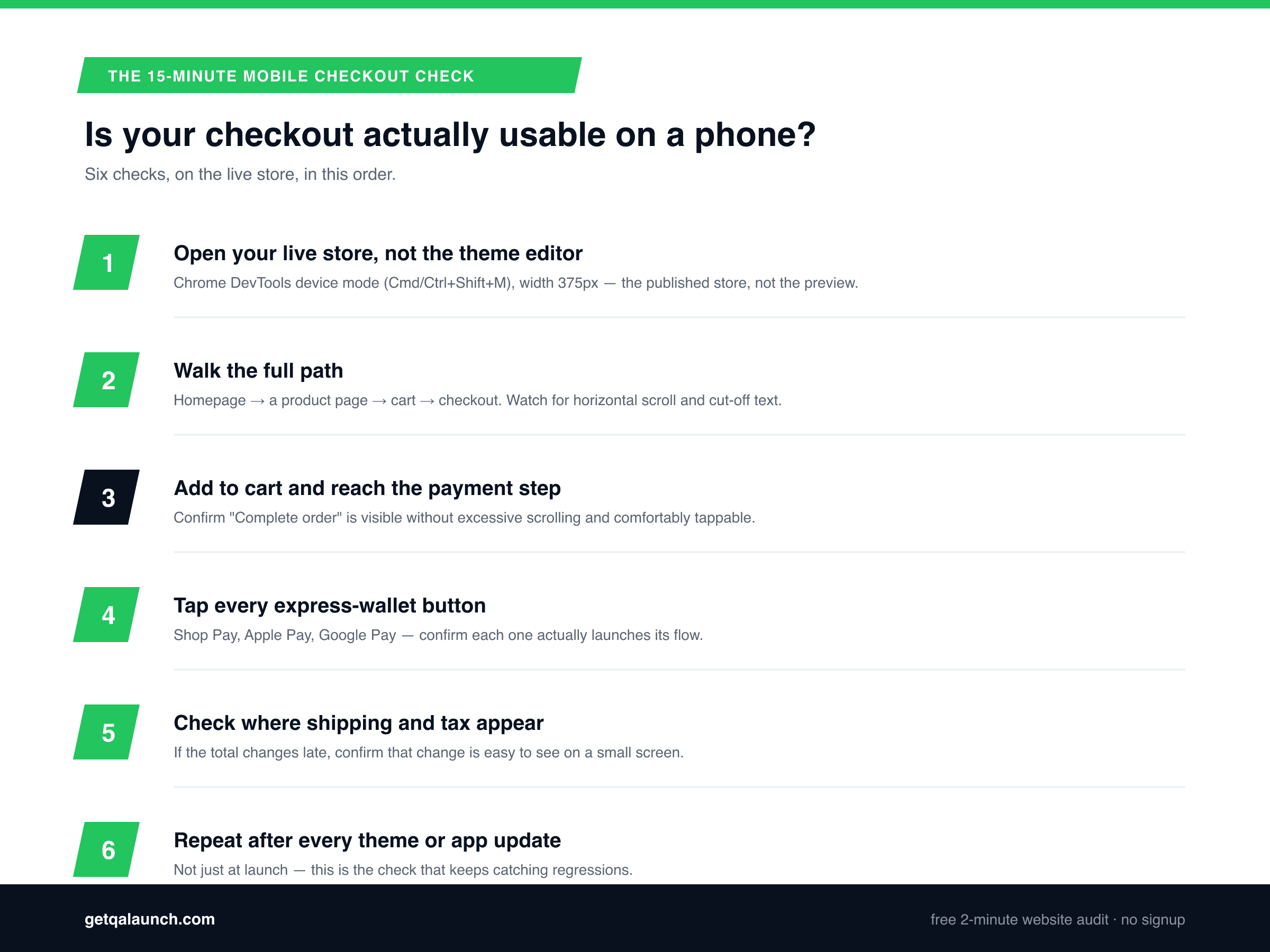
- Open your live store, not the theme editor. Chrome DevTools device mode (Cmd/Ctrl+Shift+M), width 375px. The theme editor preview is not a substitute — check the published store.
- Walk the full path. Homepage → a product page → cart → checkout. Watch for horizontal scroll, cut-off text, and anything stacked awkwardly.
- Add to cart and reach the payment step.Confirm the "Complete order" button is visible without excessive scrolling and is comfortably tappable.
- Tap every express-wallet button. Shop Pay, Apple Pay, Google Pay — confirm each one actually launches its flow rather than just rendering.
- Check where shipping and tax appear. If the total changes late in the flow, confirm that change is easy to see on a small screen, not buried above the fold.
- Repeat this after every theme or app update. Not just at launch — this is the check that keeps catching regressions, not a one-time box to tick.
This isn't unique to Shopify
The same root cause — a page reviewed on desktop, shipped to visitors who are mostly on phones — shows up everywhere, not just at checkout. It's the same mechanism behind why sites look fine on desktop but break on mobile generally, and behind contact forms that silently fail — a success state that renders correctly while nothing actually completed underneath it. Checkout is just the highest-stakes place it can happen.
Frequently asked questions
Why is my Shopify checkout abandonment rate so much higher on mobile?
Mobile checkout abandonment runs meaningfully higher than desktop on most stores because mobile visitors hit more friction: small tap targets, keyboard-heavy forms, slower connections, and theme customizations that were only ever checked on a desktop monitor. The cart and product pages usually work fine — the drop-off concentrates at checkout, where every extra tap costs you customers.
How do I test my Shopify store on mobile without buying a bunch of test devices?
Open your live store (not the theme editor) in Chrome, press F12, then Ctrl+Shift+M (Cmd+Shift+M on Mac) to open device mode, and set the width to 375px. Walk the full path — homepage, product page, cart, checkout — with a real test card if your payment provider supports test mode. Emulation catches nearly all layout bugs; confirm the checkout once more on an actual iPhone before you trust it.
Can a theme update really break my checkout without me noticing?
Yes, and it’s one of the most common ways Shopify stores lose sales silently. Theme and app updates can change how a section renders at mobile widths, overwrite customizations, or introduce an app-block conflict — all while the desktop view still looks identical to how you remember it. The only way to catch it is to check the mobile view again after every update, not just once at launch.
Does Shopify’s free theme check catch these mobile bugs?
No — Shopify’s built-in tools check theme performance scores and code quality, not what a real visitor experiences on their own phone. A theme can pass every automated Shopify check and still have a checkout button that's unreachable at 375px, because that requires actually rendering the page at that width and looking at it, not scanning the code.
What’s the single highest-impact thing to check first?
The checkout button and payment step at 375px width, on the theme you're actually running — not a demo theme. If a customer can't comfortably see and tap "Complete order" on their own phone, everything else you fix matters less. Check that before spending time anywhere else.
Can QAlaunch test my Shopify store automatically?
Yes — QAlaunch opens your live store in a real cloud browser at both desktop and mobile widths and checks your public pages (homepage, collections, product pages, cart) for layout breaks, broken buttons and links, and usability issues, the same way a real visitor would encounter them. It cannot complete an actual purchase, so the final payment page itself needs the manual check above. Free scan, about two minutes, no signup.
See what a real visitor sees on your store
QAlaunch opens your live store in a real cloud browser at desktop and mobile widths and checks your public pages for layout breaks, broken buttons and links, and usability issues — the same way a real customer would encounter them. Free scan, about two minutes, no signup.
More on Shopify-specific issues in our Shopify store audit guide, or see why sites look fine on desktop but break on mobile for the general pattern behind bugs like these.