
Why Your Website Looks Fine on Desktop but Broken on Mobile
Websites look fine on desktop but break on mobile because they were built and checked at desktop width. At 375px, fixed-width elements overflow, text becomes unreadable, and hover-based menus stop working — and the owner never sees it, because owners test on their own machines. The fix: audit your live site at real phone widths, page by page.
This is the single most common complaint behind the audits we run: "my site looks perfect on my laptop, but someone just told me it's a mess on their phone." It's not bad luck and it's not a mystery. It's a predictable result of how websites get built — and after nine years of QA work, I can tell you it almost always comes down to the same handful of causes.
Below: why it happens, the six specific bugs behind nearly every "broken on mobile" report, and how to check your own site properly in about fifteen minutes.
Why does a website break on mobile in the first place?
A phone doesn't get a special copy of your website. It gets the same HTML and CSS your desktop gets, squeezed into a viewport roughly one quarter as wide — 375 to 430 pixels instead of 1,400+. Whether that goes well depends entirely on whether your layout was written to bend: columns that stack, images that shrink, text that wraps, menus that collapse.
Layouts bend when they use responsive rules — breakpoints that say "below this width, do this instead." They snap when something in them has a fixed size: a table that's 900px wide no matter what, a hero image with a hard-coded width, a section padding that made sense on a monitor and eats half the screen on a phone.
Here's the part that matters: onerigid element is enough. A single component wider than the viewport — even by a few pixels — gives the whole page a horizontal scrollbar and makes everything feel broken, even if the other 95% of the page is perfectly responsive. That's why sites don't degrade gracefully on mobile; they tend to look either fine or wrecked.
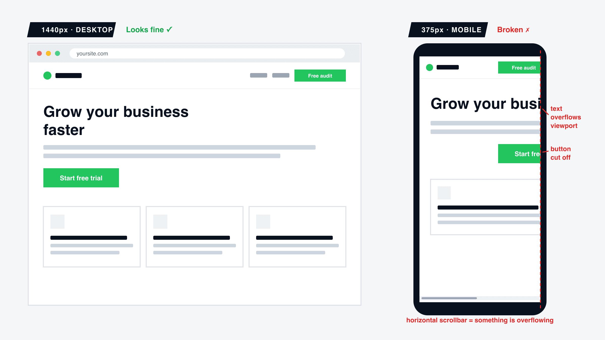
The six mobile bugs behind almost every "it's broken on my phone"
1. Horizontal overflow — the one-pixel problem
The page scrolls sideways as well as down. Usually caused by a full-width image, an embedded table, a code block, or a section with fixed padding that adds up to more than 375px. The symptom visitors describe is vague — "the site feels off" — because content keeps drifting out of view as they scroll. Check: at 375px, try to swipe the page left. If anything moves horizontally, something is overflowing.
2. Fixed widths that refuse to bend
A pricing table locked at four columns. A form field set to 600px. A grid of cards that never stacks. On a monitor these read as tidy structure; at phone width they compress into overlapping, truncated fragments. This is the most common bug in sites assembled from mixed sources — a theme here, a copied section there, an AI-generated block on top — because each piece made its own assumptions about available width.
3. Text and buttons that become unreadable at 375px
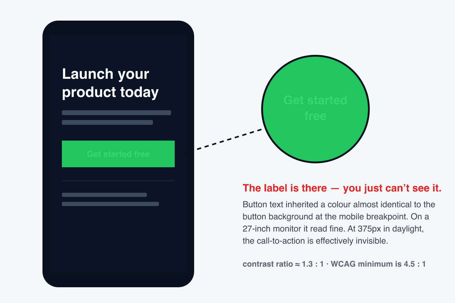
Contrast and size that pass on a 27-inch monitor can fail completely on a phone in daylight: 13px grey text on a light background, a CTA whose label inherits a different colour at mobile breakpoints and quietly vanishes into the button behind it. We flag some version of this in a large share of the sites we audit, and it's the most expensive bug on this list — an invisible call-to-action doesn't get tapped. This is the same class of bug as #2 in our rundown of the nine bugs almost every AI-built site ships with.
4. The hero that swallows the whole screen
A hero section sized for a widescreen preview often renders at 150% of a phone's viewport height. A mobile visitor lands, sees a heading and a background — no value proposition, no button — and has to scroll on faith to find out what the site even does. Many don't. Check: load your homepage at 375px and ask one question — can I see what this site offers and a way to act on it, without scrolling?
5. Tap targets built for a mouse cursor
A mouse pointer is a single pixel; a fingertip is roughly a 44px circle. Links stacked tightly in a footer, tiny carousel arrows, close buttons in the corner of a popup — all precise and comfortable with a mouse, all frustrating lotteries with a thumb. The visitor taps the wrong thing twice, then leaves. If interactive elements on your site are smaller than about 44×44px or packed closer than 8px apart, mobile users are mis-tapping.
6. Hover interactions that don't exist on a touchscreen
Dropdown menus that open on hover, tooltips that explain a feature, image zooms, reveal-on- hover buttons on cards: there is no hover on a touchscreen. At best the first tap substitutes for it; at worst the content is simply unreachable. If any information or navigation on your site is only available on hover, a mobile visitor cannot get to it at all.
Why didn't I notice my own site was broken?
Because you test your site under the exact conditions that hide these bugs. You open it on the machine you built it on, at the window size you designed for, already knowing where everything is and what every button does. You are the best-case visitor. Your customers are the worst case: a phone, one thumb, no context, and about three seconds of patience.
This isn't carelessness — it's structural. Nobody habitually browses their own site on a phone the way strangers do, and mobile bugs produce no error message, no crash log, no alert. The page renders. It renders wrong, silently, only on devices you aren't looking at. The only counter to it is deliberately testing as the stranger.
Does this happen more with AI website builders like Lovable and Bolt?
Yes, measurably — and there's a specific reason. When you build with Lovable or Bolt.new, you watch your site take shape in a preview pane that renders at desktop width. Every prompt, every iteration, every "that looks great, ship it" moment happens at a width your mobile visitors will never see. The AI does often generate responsive classes — but nobody verifies them, because the one screen the builder shows you is the one screen where everything already works.
The result is a site that is genuinely finished on desktop and completely unreviewed on mobile. Not broken by the AI — broken by the workflow. Which is also why the fix isn't "prompt better"; it's reviewing the deployed site at phone width, the one place the builder never showed you.
How to check your site on mobile — the 15-minute version
You don't need a device lab. You need your live site — not the builder preview, not localhost — and this sequence:
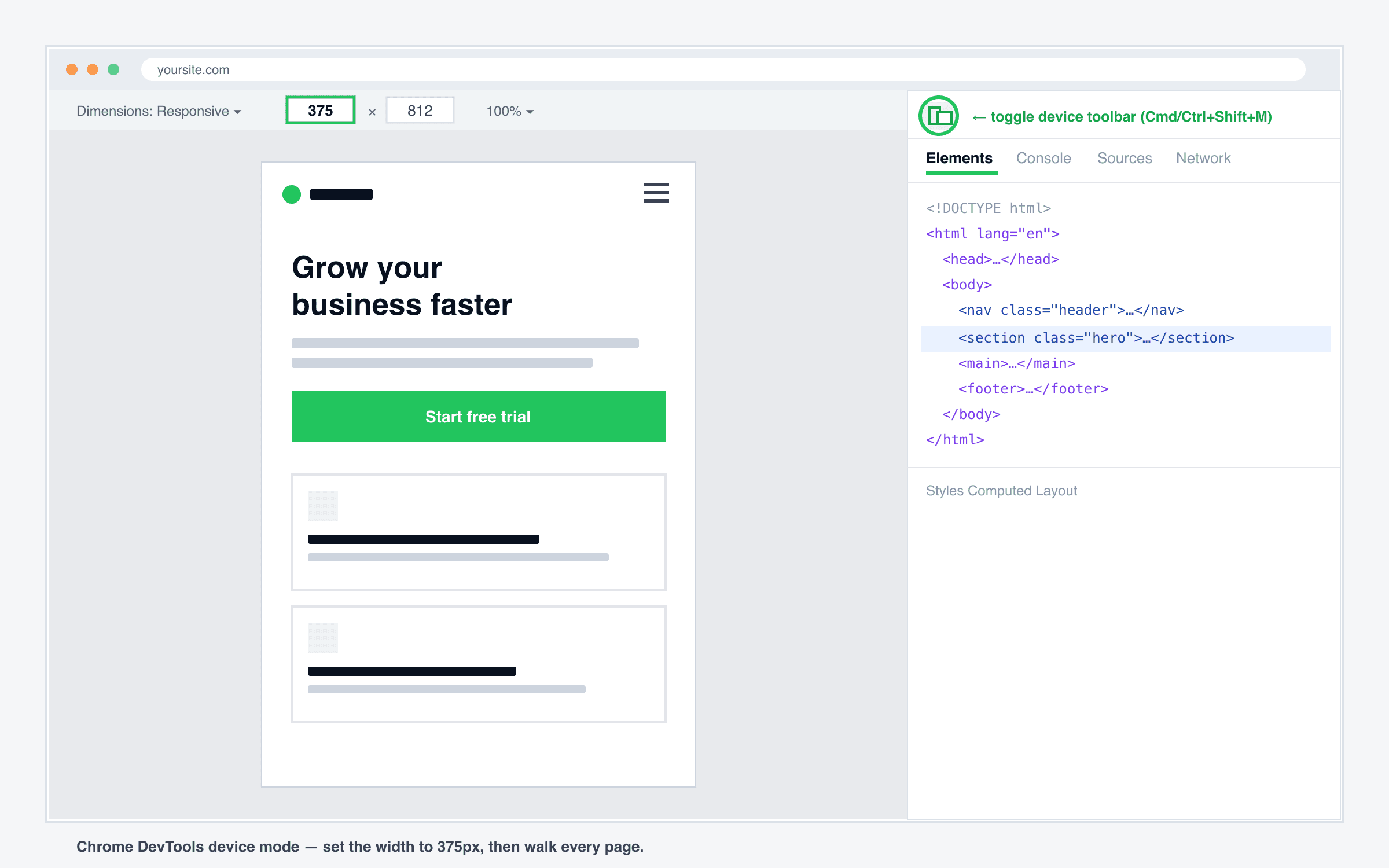
- Open DevTools device mode.In Chrome: F12, then Ctrl+Shift+M (Cmd+Shift+M on Mac). Set width to 375px — the narrowest mainstream phone. Don't pick a generous width; if it survives 375, it survives everything.
- Walk every page, top to bottom.You're looking for: horizontal scroll, overlapping or cut-off text, images spilling out of containers, sections with absurd empty space, anything requiring a squint.
- Tap everything. Every nav item, every dropdown, every button, every footer link. Menus that open on hover and buttons that go nowhere reveal themselves here.
- Submit your forms.Actually fill and send them at mobile width — validation and keyboard behaviour differ on phones, and a form you can't complete with a thumb is a dead form.
- Repeat the critical path on a real iPhone. Emulation catches layout; Safari catches the rest. Homepage → key page → form or checkout, once, on an actual device.
Fifteen minutes, honestly spent, finds most of it. The failure mode isn't that this is hard — it's that nobody does it after every change, and mobile layouts break quietly with every edit, theme update, and new section.
Frequently asked questions
How do I see the mobile version of my website on my computer?
Open your site in Chrome, press F12 (or right-click → Inspect), then click the small phone/tablet icon in the top-left of the DevTools panel — or press Ctrl+Shift+M (Cmd+Shift+M on Mac). Set the width to 375px. That’s a realistic small phone. Now use your site: scroll every page, tap every button, open every menu.
What screen width should I test my website at?
If you only test one width, make it 375px — the iPhone SE and the narrowest common viewport. If a layout survives 375px it almost always survives everything wider. If you have five more minutes, also check 390px (recent iPhones) and 360px (many Android phones).
Is browser device emulation the same as testing on a real phone?
It’s about 80% of the way there, and it catches nearly all layout bugs — overflow, unreadable text, broken grids. What it doesn’t catch: real touch behaviour, iOS Safari quirks (date inputs, viewport height, some CSS features), and how the page feels on a real connection. Use emulation for layout, then confirm the critical flows on an actual phone.
Why does my website look different in Safari on iPhone than in Chrome?
Every browser on iOS uses Apple’s WebKit engine, which handles some JavaScript events, form controls, and CSS features differently from Chrome’s engine. If your site was built and previewed only in Chrome — which is what every AI builder’s preview pane uses — Safari is where the surprises live. Test it: that’s effectively every iPhone visitor you have.
How much of my traffic is actually on mobile?
Check your own analytics rather than trusting industry averages, but for most marketing sites, blogs, and stores it’s the majority of visits — and for traffic from social media links it’s nearly all of it. Practically: the version of your site you look at least is the version most of your visitors get.
Can a tool check mobile responsiveness for me automatically?
Yes — that’s exactly what QAlaunch does. It opens your live site in a real cloud browser at both desktop and phone widths, takes screenshots of what actually renders, and runs automated checks plus an AI visual review to flag overflow, unreadable text, broken layouts, and buttons that don’t work. The free scan takes about two minutes and doesn’t need a signup.
Or let a real browser check it for you
The 15-minute check above is exactly what QAlaunch automates — plus about 30 more checks. It opens your live site in a real cloud browser at desktop and phone widths, screenshots what actually renders, and flags overflow, invisible buttons, unreadable text, and broken layouts in plain English. The free scan takes about two minutes, no signup.
Built with an AI tool? See the platform guides: testing Lovable sites and testing Bolt.new sites, or the full list of nine bugs AI-built sites ship with.
Running a Shopify store? Mobile is where checkout specifically breaks down — see why Shopify stores lose mobile customers at checkout.